Melirrito
(west)
PROJECT DISCIPLINES:
Graphics | Packaging | Shop design
BRIEF:
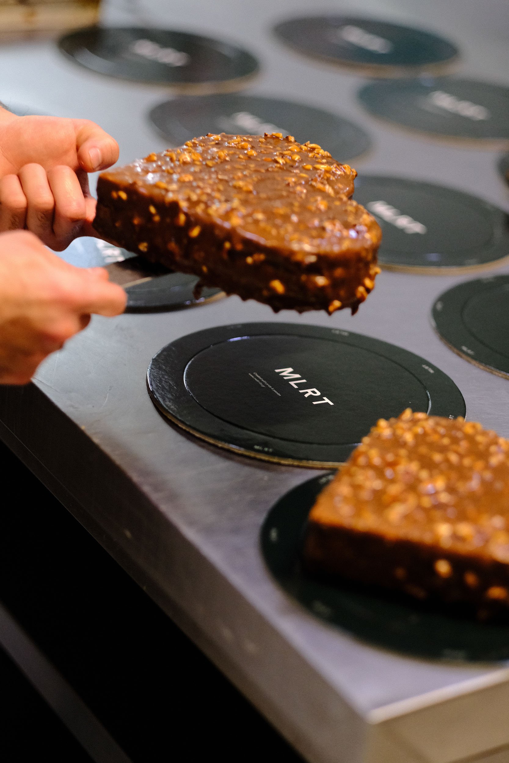
The first shop of Melirrito after our rebranding collaboration was the best way to implement our ideas to a total shop for the brand. The design aims to shy away from bakery designs traditionally seen in Greece. Using stainless steel and white powder coated surfaces paired with lacquered orange & green surfaces the shop is the first manifestation of the rebrand into a shop.
The prominent round light in the center of the shop aids to bring the shop’s displays closer to the people passing by and to establish the logo to a new part of the city.


Shop design


3D rendering


Graphic identity / packaging
The redesign of the Melirrito brand aims to reposition the business as the definitive destination for baking and delicatessen goods, while moving away from the classical aesthetic commonly found in bakeries.
The development focused on emphasizing key elements of each product through a colorful, modern approach designed to appeal to an audience under 50, utilizing online campaigns and printed photos.
The logos are inspired by the large wood-fired oven that still bakes bread daily, serving as a key element throughout the brand's details and applications.
The semicircular shape of the oven door will also be used as a stand-alone element, drawing attention to important information that needs to be communicated.