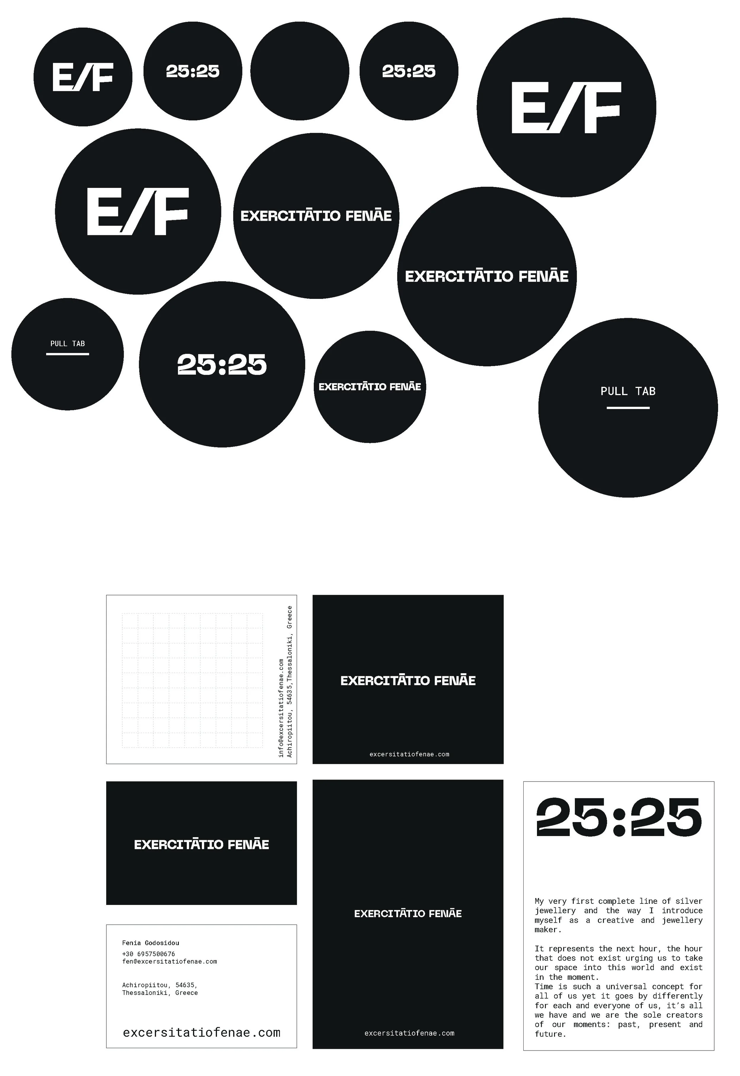
Excercitatio Fenae
PROJECT DISCIPLINES:
Graphics | Packaging | Print | Photography | Video | Exhibition booth design

BRIEF:
To develop an identity for a company, from the ground up is by far our favorite way to work on several disciplines of design at the same time achieving a consistent thorough communication output from our clients to their clients.
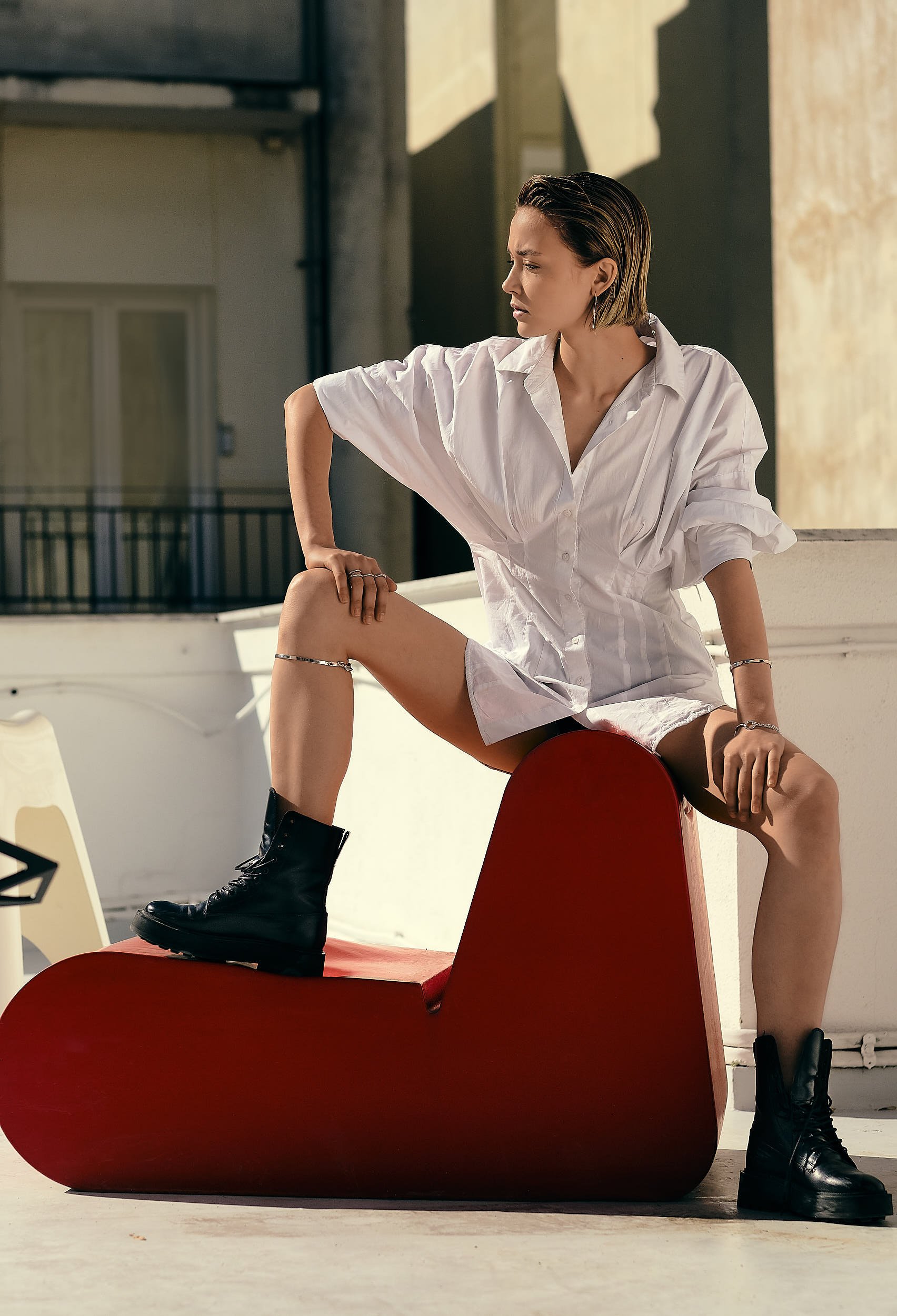
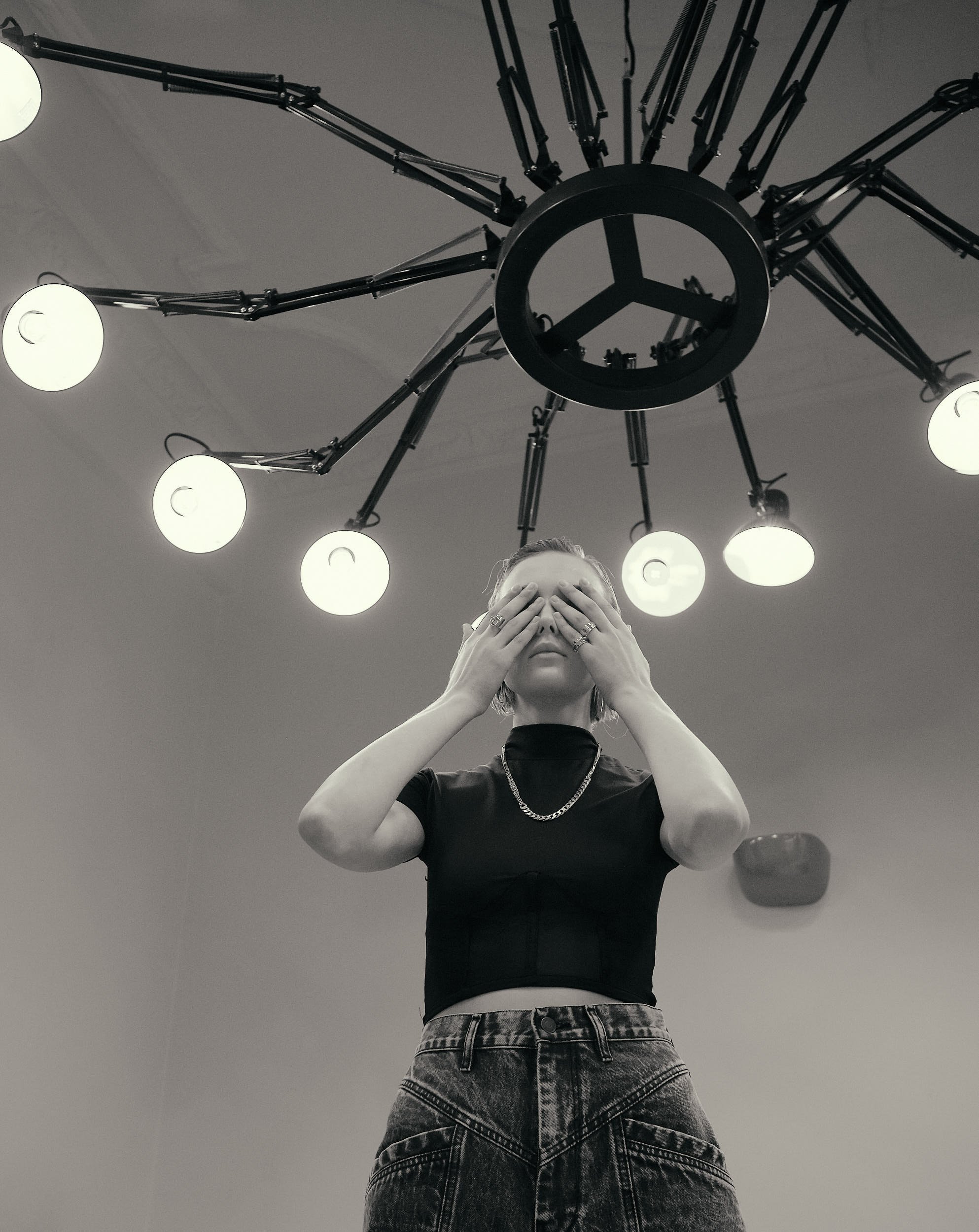
Our approach for E/F was to create a brand identity that evokes individuality and rebellion,
The transparent tube packaging, a graphic prelude inspired by the metal’s atomic properties, sets the stage for unveiling these design pieces.
Breaking traditional norms, the genderless creations invite open-minded individuals to embrace self-expression through avant-garde forms.
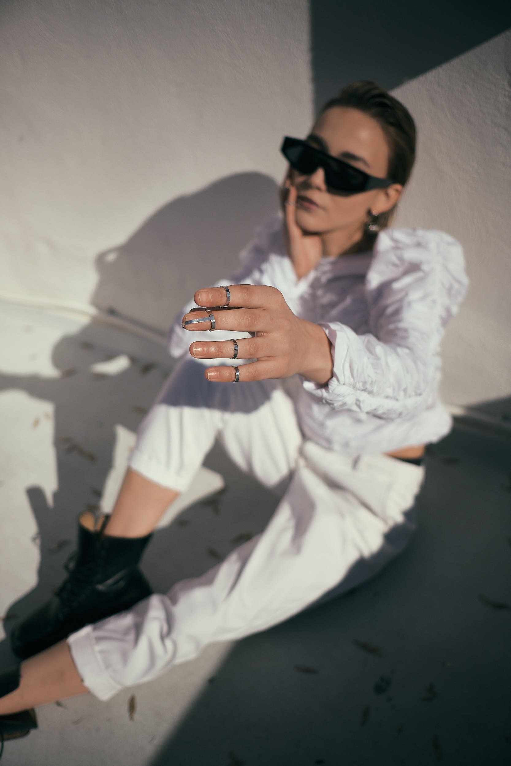
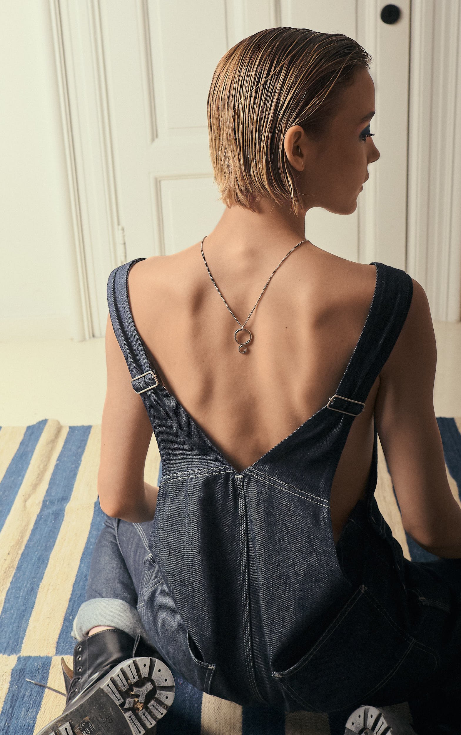
Each piece is a canvas for creative expression, a unique narrative of exceptional craftsmanship and that is evident also on the logotype with its sans serif bolt lettering with deep evident ink traps.
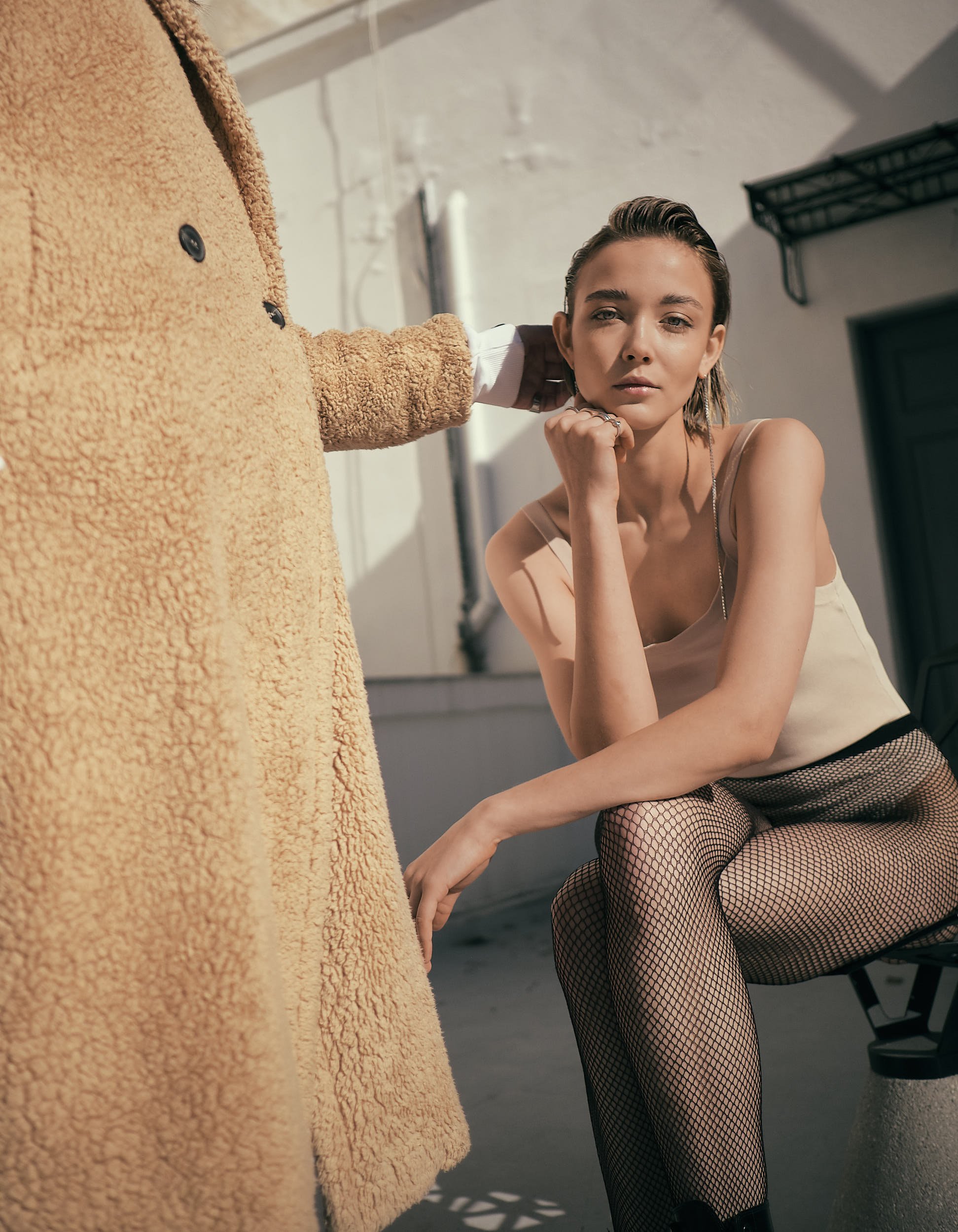
As each piece is handmade we have created a series of photos from the artist’s workshop to showcase the level of work and detailing that goes into every piece.


Atelier / craftmanship
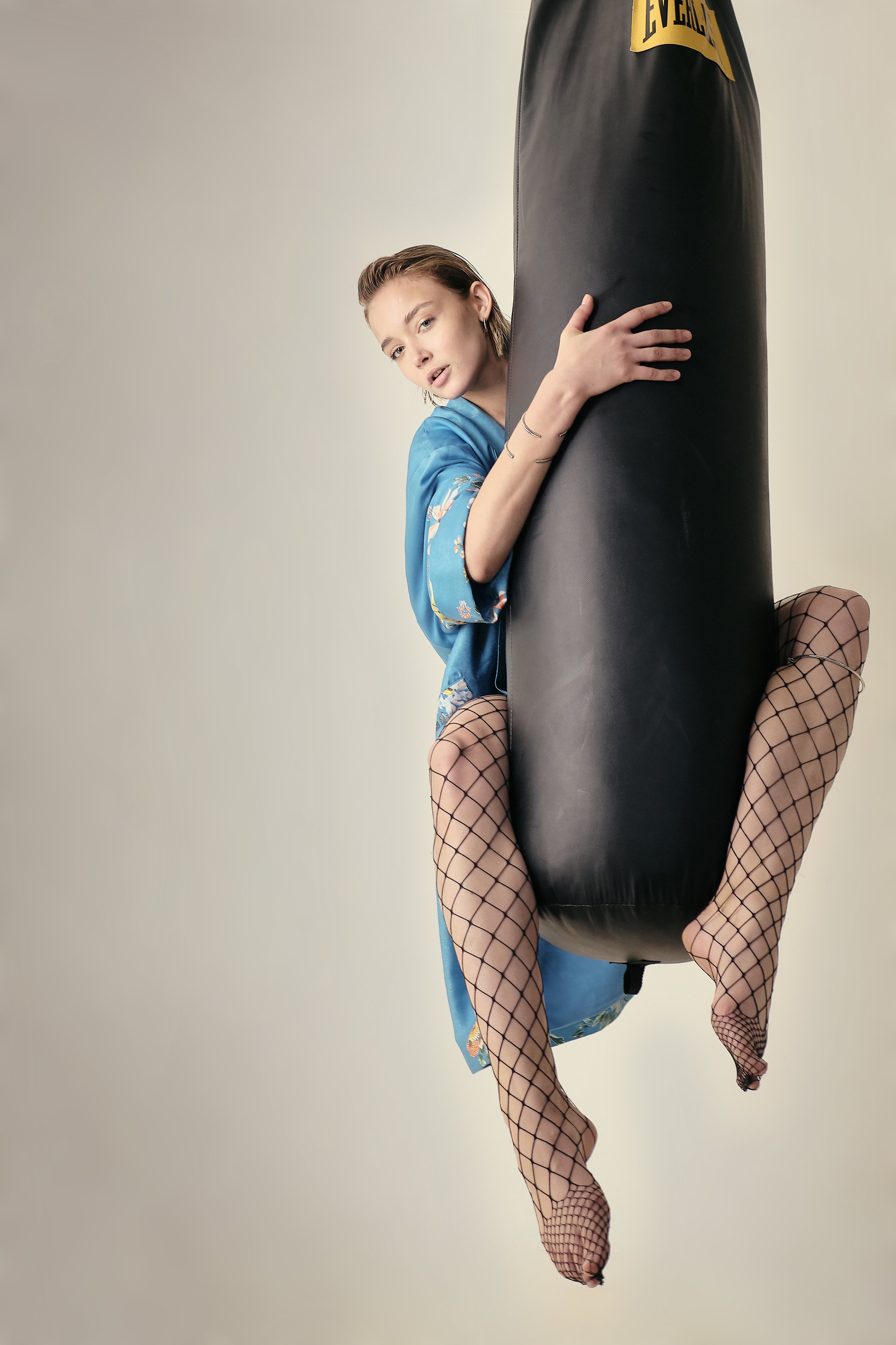
campaign
E/F’s design philosophy celebrates craftsmanship and individuality. Each piece is hand-forged from raw silver, shaped and polished with precision to highlight every intentional line and curve. The transparent tube packaging, inspired by metal’s atomic structure, offers a first glimpse into the detailed artistry behind each creation.
Rejecting traditional norms, these genderless designs encourage open-minded individuals to embrace self-expression through avant-garde forms.
Every piece of E/F jewelry is a narrative of exceptional craftsmanship, embodying the designer’s dedication to artistry and uniqueness.


Photo / Video campaign
Sed ut perspiciatis unde omnis iste natus error sit voluptatem accusantium doloremque laudantium, totam rem aperiam, eaque ipsa quae ab illo inventore veritatis et quasi architecto beatae vitae dicta sunt explicabo.